The state of accessibility in e-commerce
At the end of February, 2018, I had the opportunity to present on the state of e-commerce and accessibility at the annual meeting of one of the biggest names in e-commerce.
It was very exciting to have the chance to present this topic to the e-commerce team of an organization that is one of the top e-commerce names of all time.
Did you know that there is no truly accessible e-commerce storefront online today? (If you think you have found one, please let me know in the comments). Online retailers are effectively “closed” for audiences who require an accessible experience.
There are so many reasons for organizations to make their e-commerce storefronts accessible:
- The market is huge (~35 million people with web impacting disabilities in the US, ~3/4 million in Canada).
- It’s the right thing to do.
- In many instances there are financial repercussions for not making a website accessible.
- The tools and knowledge to make a website accessible are out there.
So why isn’t this happening? Read on to find out why…
But first, what is accessibility? I like the definition presented by the Canadian National Institute for the Blind:
Accessibility means access. It refers to the ability for everyone, regardless of disability or special needs, to access, use and benefit from everything within their environment.

One of the first times I thought about accessibility was on a trip to the Great Wall of China in 2006.
The Great Wall is one of the wonders of the ancient world, as you know. There’s no denying that it wasn’t designed to be accessible. That’s understandable for a structure built over 2000 years ago.
As a healthy, active person, I wouldn’t have noticed the accessibility challenges of the Great Wall if I had not been traveling with my elderly father in law. He simply couldn’t climb up all of those stairs. It was the first time that someone else’s accessibility requirements affected me personally.

The next time I recall noticing accessibility barriers is when I had a baby. This isn’t a picture of me but it illustrates what all parents face when they want to take their child out in a stroller.
Carrying a stroller up the stairs is challenging. Depending on how many stairs there are, it could be impossible without help.
It made me empathize with people in wheelchairs who always faced this problem that had never affected me before.
And it struck me how willing strangers were to help me carry the stroller up the stairs. People are kind, and they want to help.

And people are smart. They find workarounds. Even when something isn’t designed for accessibility, sometimes people can find a way to succeed in their task.
But we also have an opportunity to consider everyone’s needs up front, and to design accessible experiences purposefully, so that everyone can enjoy them.

This ramp won an urban design award and it shows that it’s definitely possible to have an experience that is both beautiful AND accessible.
What I’m trying to convey is that when we make a physical space accessible, it actually benefits everyone.

But what about web accessibility, who benefits from that? Spoiler alert — it’s also everyone.
With the advent of smartphones we are all subject to a degree of new challenges when trying to navigate websites. Here I’m showing how the glare on the screen can cut down on anyone’s ability to view content:

We have all ages of people surfing the internet, with varying degrees of dexterity and vision loss, who wouldn’t necessarily self-identify as needing an “accessible” experience.
We also have to consider the temporary disabilities we’re all subject to — temporary vision loss or when you injure your arms.
But let’s talk about the population of people with disabilities:

I’ve been referring mostly to ambulatory disabilities so far, but let’s talk about the other three types: Cognitive issues, hearing loss, and vision loss.
I refer to these as “web impacting” disabilities, because these disabilities affect peoples’ ability to navigate the web with a mouse-pointing device. How many people are impacted by these disabilities? A significant number.
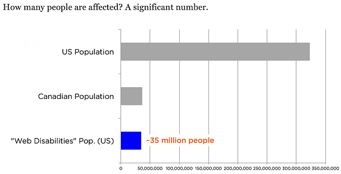
The top grey bar represents the number of people online in the US. The middle grey bar is the population of people online in Canada.
I want to draw your attention to the blue bar at the bottom, which is the population of people with “web impacting” disabilities in the US. ~35 million people. This is almost the same as the population of Canada.
Here are some Canadian numbers:
- ~half a million Canadians have low vision or vision loss. (Like the whole population of Newfoundland and Labrador).
- Canadians who identify themselves as culturally Deaf comprise more than 350,000 people across Canada. (Canadian Association of the Deaf, 2007)
That’s about ¾ of a million people in Canada alone.
For Canadian online retailers, it’s like there is an invisible store that already exists that could be servicing a community the size of Winnipeg, if it were accessible. For the US, there’s an invisible store that could be servicing a community the size of Canada.
So how has this population been experiencing online retail throughout the years? Let’s see…

From the late 1990s onward, the internet gradually became part of our lives, until in 2016 it was estimated that 3.4 billion people regularly used “the Web”.

With more and more people using the internet, physical modes of content were steadily replaced by electronic modes of content. A big part of the shift was that commerce at physical locations has been replaced or augmented by e-commerce storefronts.

This shift had the potential to remove many of the barriers to communication that existed for disabled people in the physical world, but only if websites were designed and developed accessibly.
So were the barriers removed? Let’s see.

Here are some quick highlights of e-commerce history. So many things happened during this time frame, so many technological advances. We went from the first web browser in 1989 to the launch of Amazon in 1995, Dell making $1 million dollars in online sales in 1997, to B2B commerce reaching $700 billion dollars in transactions in 2001, to the launch of bitcoin in 2009, to the launch of Apple Pay in 2014, until today, where e-commerce comprises more than 10% of US retail sales.
Now let’s look at what was happening from a web accessibility perspective during the same time frame…

It’s interesting to note that there were always screen readers, even back in 1989 with the launch of the first web browser. Some of the web accessibility highlights during this time frame include the creation of the first accessibility guidelines in 1995, the same year Amazon launched. The WCAG (Web Content Accessibility Guidelines) 1.0 appeared in 1998, the same year Paypal launched. US government regulations around Federal government website accessibility were enacted in the year 2000. Canadian laws were enacted in the province of Ontario in 2005. The WCAG guidelines in their second version were launched in 2008. The US Department of Justice began to consider whether or not websites should be considered places of public accommodation under the American Disabilities Act in 2010 (that still hasn’t been decided), and the list goes on.
You might think that with all of these available tools and standards and even laws, that e-commerce experiences might be in a good spot from an accessibility perspective.
But they aren’t, and that is reflected in all of the lawsuits happening over the past years in the US.
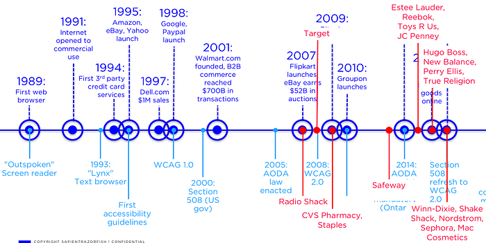
Each of the red dots represents a major lawsuit against a retail brand because of the inaccessibility of their website. These are US lawsuits. These have been happening since the mid-2000s, but have increased lately.
In Canada, the landscape has been a bit different. In Ontario companies needed to self-identify as being compliant or not starting last year, with the idea that the government will work with companies to help them get compliant.
Which brings us to today.

There is no eCommerce site that I know of that is completely accessible. Most people today can hardly conceive of life without the Internet, or without e-commerce. But these online retail stores are effectively CLOSED for this population.

This a huge market that businesses should want to tap into, and it’s the right thing to do. We have the tools, the knowledge is out there.
SO WHY ISN’T IT HAPPENING? What it all boils down to is that it’s a design problem. Steve Jobs said:
Design is not just what it looks like and feels like. Design is how it works.
And the web works in a variety of ways:
- It can work with a mouse pointing device and a monitor, the way many of us probably use it.
- It can work with just a keyboard and a monitor. Consider someone who has a tremor and cannot focus their mouse pointer and needs to use a keyboard instead. Or, a sighted person who may be paralyzed, and use a puff and suck device that mimics the function of a tab key.
- Or, people can use their keyboard in conjunction with a screen reader.
In both of these latter two cases, the main way people are navigating is with their keyboard or some keyboard emulator, not a mouse. But most people who design websites today actually use a mouse pointer to navigate. This is a critical point.
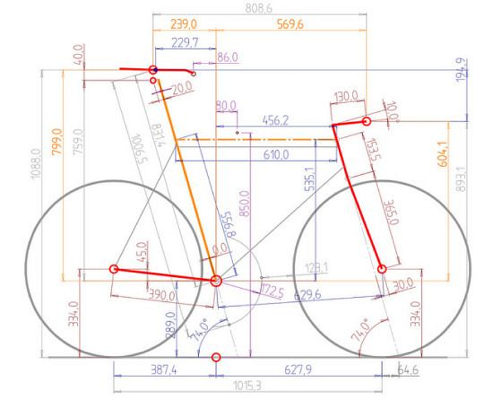
Would you ask someone to design the perfect bike who has never ridden one?
You probably wouldn’t. But that is effectively what we’re asking designers to do, when they usually navigate the web using a mouse pointing device, and we ask them to start designing experiences for people who mainly use their keyboards.
Let me show you an example of a mouse user’s experience versus a keyboard user’s experience…

This screenshot shows how eye tracking software tracked a person’s gaze through a webpage. They jumped all over the place. Most of our e-commerce designs assume that a person can scan the page in this way.

But if we tracked how a screen reader goes through a page, it looks very different. It goes from left to right, top to bottom, because that’s how a screen reader works. It follows the order of content in the html file.
The designs we commonly see today work well for people who use a mouse pointer and can click on anything in any order. They tend to not work well for people who use a keyboard, who are constrained to certain pathways through the site. Let’s look at the impacts on the experience if someone takes a site designed for a mouse and tries to use it with their keyboard.
Common accessibility issues with online retail stores
- Usability basics are not considered for keyboard/screen reader users
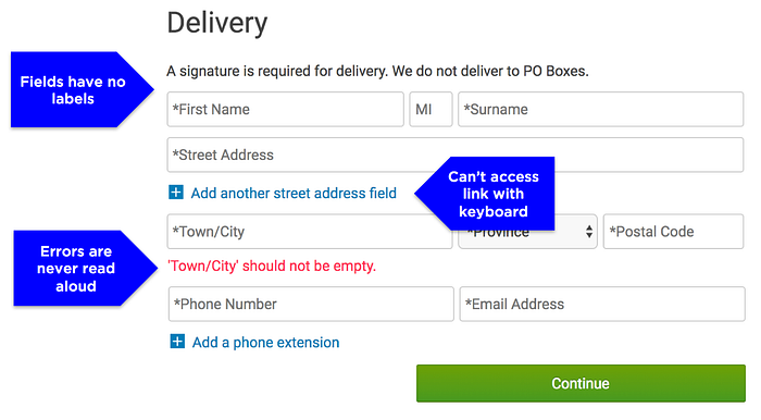
Here’s an online form from an online retail store that has been around for awhile online, having made that $1M in profits online back in 1997. Their forms are designed for sighted users who use a mouse pointing device to navigate. This results in a variety of problems for keyboard users.
The form fields have no labels. Instead, they use placeholder text, which disappears when the field gets keyboard focus. This places a cognitive load on users to remember what a field is for after they have clicked into the field. This sounds easy, but I forget things like that all of the time. Haven’t you ever started to enter your username into a field and then wondered if you shouldn’t be entering your email address?
Some of the links on the form are not accessible via the keyboard. You need to use your mouse to expand the sections. And finally, the error messages are presented to a sighted user, but are not read aloud. There is no keyboard focus handling to help users understand which field has an error.
2. Keyboard users are not given the same quantity or quality of information as mouse pointer users.

Here’s a product tile from another e-commerce giant (it has been marked up by me for the purposes of illustration). Their product tiles were also designed for sighted users using a mouse to navigate.
Links around the product image and the product name go to the same destination, so keyboard users have an extra tab stop to click through, and screen reader users hear the same information read twice. The ratings link has a meaningless label for a screen reader user (“Link, 22” instead of what the sighted user sees, which is “Average rating 4.5 stars, 22 reviews”). And finally, the price is not read with the tab stop. This means it is impossible for a screen reader user to simply tab through product tiles and quickly hear all of the pertinent information — product name and price.

Here is a screenshot of the product listing page grid from one of the top e-commerce sites (number 4 at the time of writing). Most of the content they provide to sighted users is not available to non-sighted keyboard users at a tab stop. (The image below shows content that a non-sighted user doesn’t hear with their tab stop faded out). Non-sighted users miss critical information like labels for interactive elements, color options, sale information. You’ll also notice that the next page icon has no alt attribute, so the screen reader user will hear “Link, index.ognc” instead of “Link, next page”.

3. Nobody tests to hear what the screen reader is saying.
One critical aspect that I can’t believe is overlooked is how the price is read. This screen shows product tiles from 3 different shoe stores. This demonstrates some of the issues with designing for sighted users only:
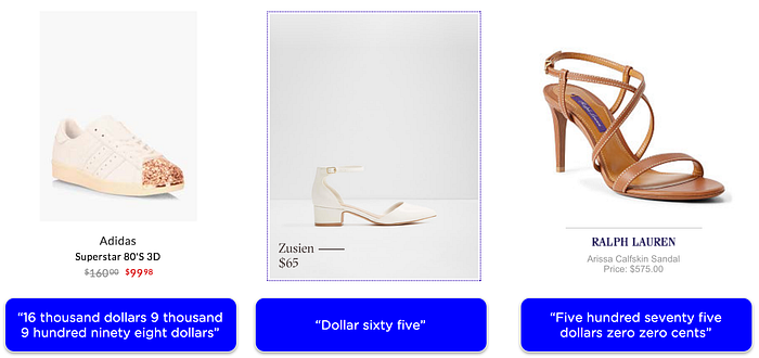
- Strikethrough is not read by a screen reader — the UX designer must employ different ways to convey price change differences. E.g. hidden text like “was $160.00, is $99.98”
- Missing decimal places mean a completely different number is read (see examples 1 and 2 above)
- Example 3 shows the right way to mark up a price — with a decimal point.
- All of these issues are easily solved, but nobody finds them because nobody tests with a screen reader.

These are just a few of the issues that I see on e-commerce sites every day that make it impossible for disabled people not only to check out but to really be part of our community. I wanted to empower all of you to understand the design flaw that creates these errors so that you can avoid it.
I conduct screen reader training internally and with clients at SapientRazorfish, and the most impactful moment during the session is when I invite the class to do some online shopping.
I let them choose any online retailer and any product, then let them loose to try to purchase that product with their keyboard and screen readers alone. I always make sure they notice that I do not constrain their choices — I let them pick any online store. That’s how confident I am that no e-commerce experience will be accessible.
We’ve tried many big names in e-commerce who I don’t want to target here, but I haven’t seen anyone get to the checkout yet.
One of the concerns I hear a lot is that if we designed to include keyboard users, it would negatively impact the design. But at SapientRazorfish we have found that:
Websites designed with accessibility in mind create a better experience for ALL users, not just disabled people.
A positive way of looking at this is that there is a massive opportunity in this area for the right online retailer (for all online retailers).
I like to imagine the amazing impact as big names in e-commerce continue to invest in adding accessibility enhancements to their sites. Imagine one of the top e-commerce sites becoming truly accessible, and what it will mean to so many people.

